


The market
New-age brokers were winning with better technology, low or zero fees and apps that made trading feel easy. Their large, growing user bases gave them an edge that older firms couldn't match with their existing tools.
A white-label trading app that lets brokerage firms launch a modern, branded mobile app of their own, without building one from scratch.
The work is under a confidentiality agreement. Enter the password to read it, or email me and I'll share it.
25+
brokers launched their own branded app on Wave 2.0
4M
trades placed every day across those apps
73K
average peak sessions at a time
 Experience design director
 Lead designer
 Product designer
I was one of two product designers at THEM Consulting, working with our lead designer and experience design director, four product managers and five developers, with the 63 Moons team in every review.
As a Product designer, I designed core trading journeys for Wave 2.0, the flagship product of our client 63 Moons: from turning research into flows, to screens, interactions and components for the shared design system, through to handoff and support during the build.
11 months, 2020–21 on iOS and Android
Traditional brokerage firms were losing customers to digital-first brokers with slicker, cheaper apps. 63 Moons built Wave 2.0 so any broker could launch a modern trading app under its own name, and our team at THEM Consulting designed the experience from the first workshop to the final build.
New-age brokers were winning with better technology, low or zero fees and apps that made trading feel easy. Their large, growing user bases gave them an edge that older firms couldn't match with their existing tools.
Established brokers wanted a competitive, future-ready mobile app with a genuinely better experience, to win new investors faster and keep the ones they already had.
Wave 2.0 is a white-label trading app. Each broker rebrands it and switches features on or off to match its own services, so it launches a polished app in weeks instead of building one over years.
Wave 2.0 had two sets of customers: the brokers who buy and brand it, and the traders who use it every day. We designed for traders first, because their trust and activity is what brokers were paying for.
Just starting out
Has money to invest and a lot of curiosity, but no idea which stocks to pick or where to start.
Needs
Gets in the way
Trades most days
Watches the market through the day and acts quickly on news, alerts and price moves.
Needs
Gets in the way
Years of experience
Researches carefully, trades options and manages a diverse portfolio.
Needs
Gets in the way
We spoke with brokerage firms, active traders and the 63 Moons sales team, who hear what brokers ask for every day. Brokers needed to reinvent their image with digital experiences, and a better experience had to show up in their numbers: more transactions, more engagement, more customers who stay.
Synthesising the research in a product envisioning workshop, we kept coming back to human motives rather than features. Five shaped the product more than anything else:
People act when they see gains they might miss, especially when a stock is trending or friends and influencers are profiting from it.
A good first experience and a better understanding of the market make people more willing to trade again. Early positive returns build momentum.
Avoiding a loss matters more than chasing a gain. People hold onto losing stocks or spread their money out to feel safe.
Building wealth, planning for retirement or saving for something specific gives people a reason to invest and keep investing.
A bonus, a salary hike or any large sum landing in the bank is a common moment when people decide to put money to work.
Reviewing competitor apps alongside the research showed the same gaps again and again. Each one was an opportunity for Wave 2.0.
Apps didn't match how people actually decide. New users were left to figure everything out alone.
Screens demanded constant attention and memory, from stock symbols to order states, which made people hesitate before trading.
Order statuses, market updates and news lived on separate screens, so every decision was made with part of the picture missing.
With little guidance on what to buy, people struggled to choose and often didn't act at all.
Without clear, contextual guidance, the fear of making a mistake grew. Informed decisions build confidence; guesswork erodes it.
Deep, rigid menus made it hard to find the right screen, especially during time-sensitive tasks like placing or changing an order.
We agreed five product goals with 63 Moons and used them to judge every design decision, from the smallest interaction to the navigation.
Make trading feel effortless so people trade more often. This is where brokers earn their revenue.
Give new investors an easy start and give existing ones reasons to stay instead of switching apps.
A modular product that every broker can brand, and switch features on or off, without redesigning it.
Explain what's happening at the moment it matters, so people trade with confidence rather than anxiety.
Put the most important actions within reach and make the rest easy to discover.
Three principles kept a large team consistent. When two good ideas competed, the one that served these better won.
Money is involved, so every screen has to feel dependable.
Help people feel in control of their decisions.
In a moving market, a few seconds decide the outcome.
We shipped Wave 2.0 in drops: slices of the app, each taken from a deep dive to a working handover in the same cycle. Two review gates sat inside every drop, so feedback arrived while it was still cheap to act on.
One drop
Repeats for every drop
A working session with the product owner on the drop's users, flows, edge cases and constraints, before anything was drawn.
The idea behind the drop, and its key screens built straight from the design system, so the concept already looked and behaved like the product.
The concept and key screens in front of stakeholders, early, while changing direction still cost little.
Feedback folded in, then every remaining screen and state designed, from the same components.
A second review on the complete set, to catch gaps between screens rather than within them.
The last round of changes, closed and signed off, so nothing open travelled into development.
A design walkthrough with the 63 Moons engineering team, assets handed over, and support through development until the drop shipped.
Two fixed checkpoints meant stakeholders were never surprised, and feedback landed before screens multiplied.
Key screens came out of the design system from day one, which is what made the remaining screens fast.
Staying on through development kept the shipped app true to the design.
We listed every action a trader takes and mapped them on two questions: how often do people do this, and how much does it matter when they do? The top-right corner became the heart of the app; the rest moved out of the way.
Important, less often
Important and frequent
Less important, less often
Frequent, less important
Frequent, high-stakes actions got the shortest paths and a place on the main screens. Occasional but important tasks stayed one clear step away, and everything else moved into a lighter secondary layer.
Our strategy was to lower the barriers to each decision, then give people good reasons to come back. These are the decisions that mattered most.
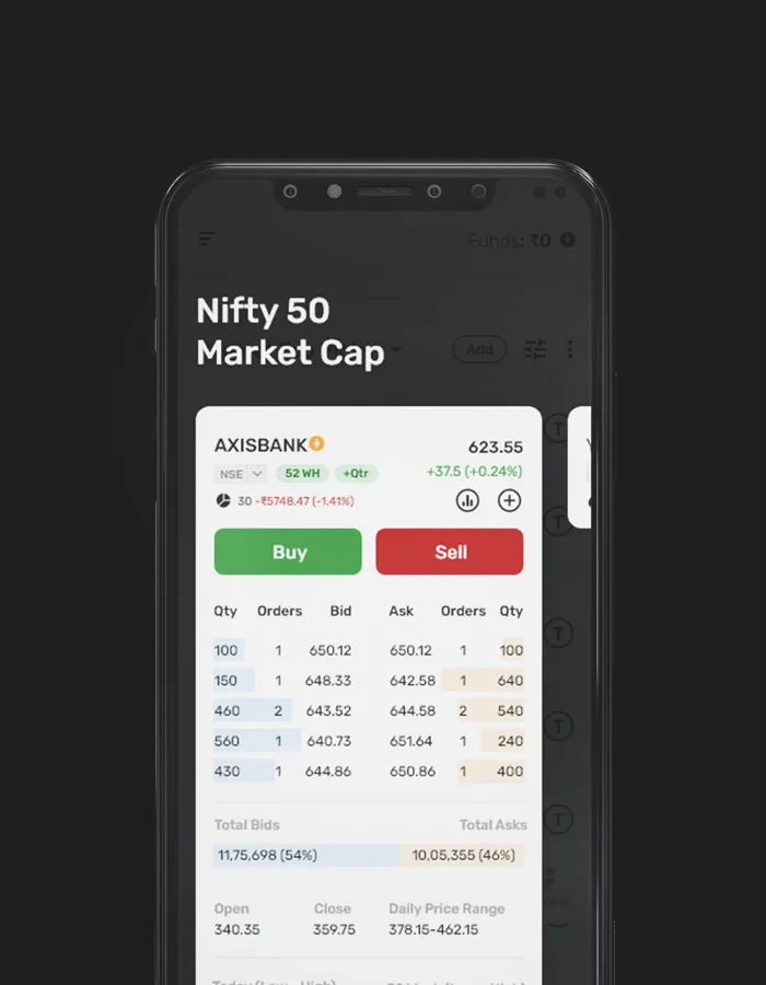
Choosing stocks was the first big hurdle for new users. They can now pick a watchlist curated by experts, or create their own, and be ready to trade in minutes.
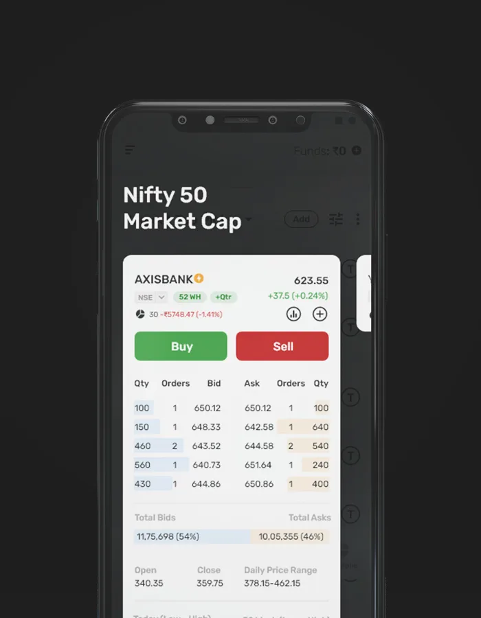
New events and opportunities from across all watchlists surface at the top of the screen, so traders stop switching between lists to find what's moving.
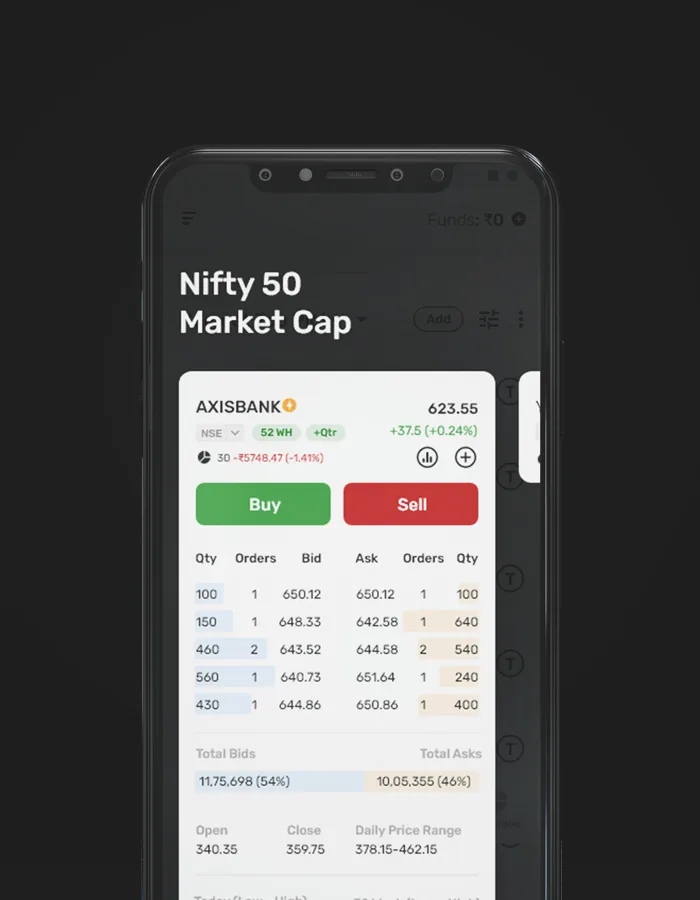
Buy and sell sit on the watchlist itself, with just enough context to act with confidence. The app flexes to different trading styles instead of forcing one path.
Getting someone to trade once is not enough. We designed small, useful reasons to come back every day:
Curated watchlists, opportunities, recommendations, news and research refresh through the day, so there's always something new worth checking.
Price alerts and portfolio milestones reach people on their lock screen at the moment they can act on them.
The things people care about stay visible outside the app, which keeps the market, and the app, top of mind.
The market screen learns what each person follows and puts it first, making it harder to switch to a competitor.
Researching a stock usually meant hopping between tools. We brought indices, top gainers, news and search into one market screen, so seasoned investors can go from a hunch to an informed trade without leaving the app.
Options are where experienced traders spend the most time, and where existing apps were the hardest to read. We redesigned the option chain around how people scan it:
Existing apps
Wave 2.0
Because Wave 2.0 is sold to many brokers, the design system is the product as much as the screens are. The Moon Design System grew to more than 250 components and made designing new features about four times faster.
Designers and developers assemble new mobile and web screens from ready-made components, and it's still how new features are designed and built today.
A flexible structure absorbs new features and changes, and lets each broker adapt any component to its own needs.
Colours, contrast and type adjust to a broker's brand from a single set of tokens, without breaking accessibility.
The system follows the Ionic framework's structure, so one build serves iOS and Android and developers and designers speak the same language.
Wave 2.0 went on to exceed expectations for 63 Moons and the brokers who adopted it.
Ship, measure, then polish.
25+
branded broker apps launched
4M
trades placed every day
2B+
trades placed every year
73K
average peak sessions at a time
Figures are approximate, based on data from 2021 to 2023.
63 Moons launched Wave 2.0 on two promises. Our team owned the first: the design. Their engineers rebuilt the platform underneath it.
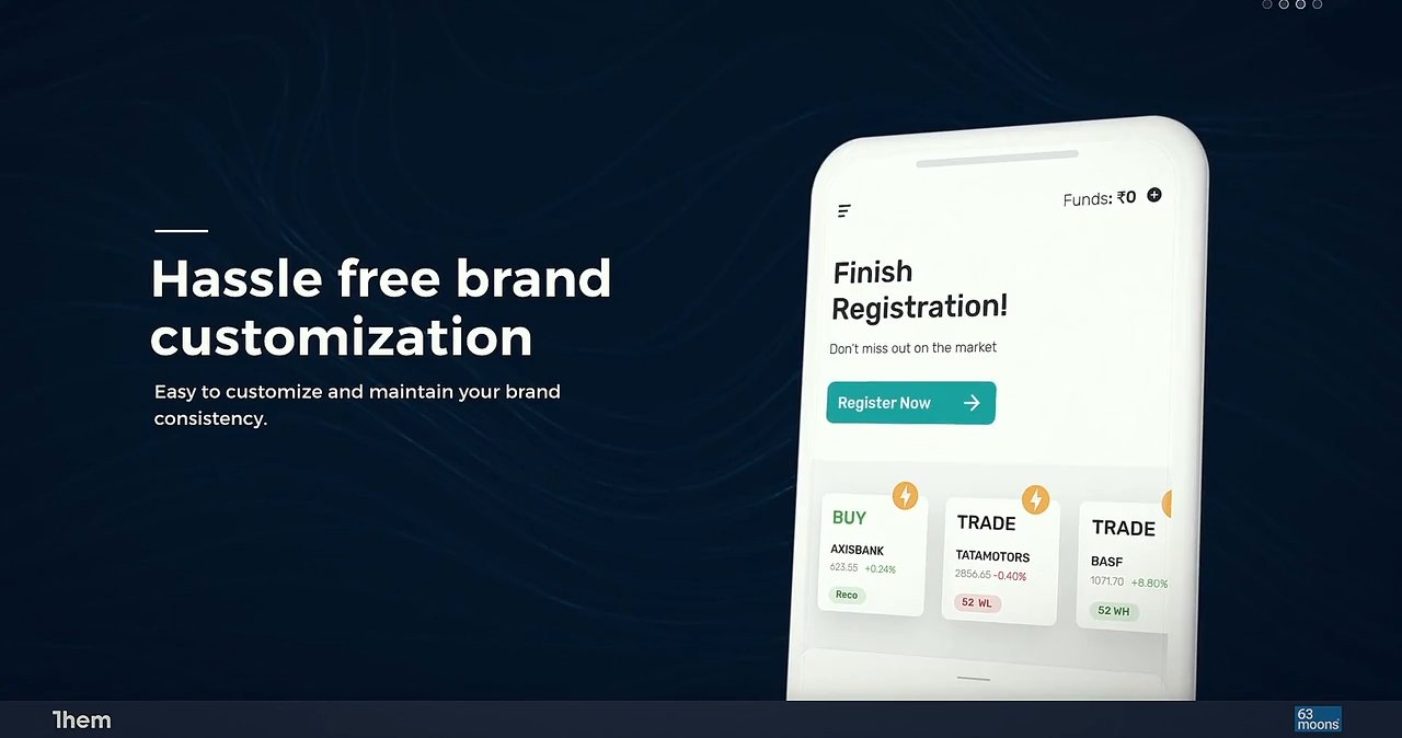
Wave 2.0 was my first project at this scale, and it changed how I work.
I kept improving the product as I understood it better, but not everything could be solved in one release. Shipping the best possible version within the limits, then improving it, beat waiting for perfect.
I started out wanting research and testing to answer everything. Some questions stay open, and a reasoned call based on experience, tested quickly, is often the right move.
Product teams naturally want to add more. The pain points, context and behaviour behind a feature decide whether it's worth building, so I learned to ask the hard questions early.
The best work came when we understood each other's constraints and made it safe to share problems early. That openness is what let a team this size move fast.