


What a basket is
A set of stocks or ETFs, weighted after careful research, that follows one investment idea, theme or strategy. People can use it for long-term wealth or shorter-term goals.
Helping first-time investors put money into expert-built portfolios on Paytm Money, and making it easy to keep investing.
The work is under a confidentiality agreement. Enter the password to read it, or email me and I'll share it.
3
days of scoping workshops with Paytm Money in Mumbai
4
core journeys designed, from first launch to a monthly SIP
30+
screens designed across iOS, Android and the web
 Design lead, agency
 UX researcher, agency
 Paytm Money product team
I was a product designer at the UX agency Paytm Money brought in for WealthBasket, working with our design lead and researcher, the client's product team in Mumbai and their back-end developers.
As a Product designer, I helped scope the project with the client, mapped the user journeys, planned our sprints and took the core flows from wireframes to visual design, reviewing each one with the developers who would build it.
About 12 months, 2020–21 on iOS, Android and the web
WealthBasket lets anyone on Paytm Money invest in model portfolios of stocks, exchange-traded funds (ETFs) and real-estate investment trusts (REITs), each built and managed by professional advisers. Diversification lowers the risk, and investors can still adjust a basket to suit them.
A set of stocks or ETFs, weighted after careful research, that follows one investment idea, theme or strategy. People can use it for long-term wealth or shorter-term goals.
Anyone who wants a diversified, low-cost portfolio without picking every stock themselves, from first-time investors to people who invest every month.
Scoping the project with the client, mapping the journeys, and designing onboarding, the first purchase, monthly SIPs and the web view.
A basket asks people to trust stocks they didn't choose, picked by an adviser they've never met. For a first-time investor that is a big step, and the app had to earn that trust before asking for any money.
At the same time, people who already invested wanted the opposite: fewer explanations and faster ways to add money. One design had to serve both without slowing either down.
Contextual interviews showed a dilemma: new investors need control and transparency to feel safe, while everyday investors want convenience. I mapped a journey for each, which showed the moments that mattered most.
New to investing
Has savings to put to work, but doesn't know which stocks to pick or whom to trust.
Needs
Gets in the way
Invests every month
Already holds baskets, checks in often and wants to add money without thinking about it.
Needs
Gets in the way
Before the project, the agency had mapped a long list of journeys through an ethnographic study. A three-day scoping workshop at the client's offices in Mumbai narrowed them down to the moments with the most impact on the business, and I tested the existing platform to see basket investing from the user's side.
New investors wanted to see inside a basket, its stocks, weights and the adviser behind it, before putting money in.
First-timers wanted to try, review and change details before any money moved. A guided trial run did more than any explainer.
Once invested, people wanted to top up or start a SIP in a few taps, without the hand-holding.
After the workshop, my team and I turned the discussions into a set of work packages and a recommended scope. From there the work ran as a series of sprints, with research and testing between them.
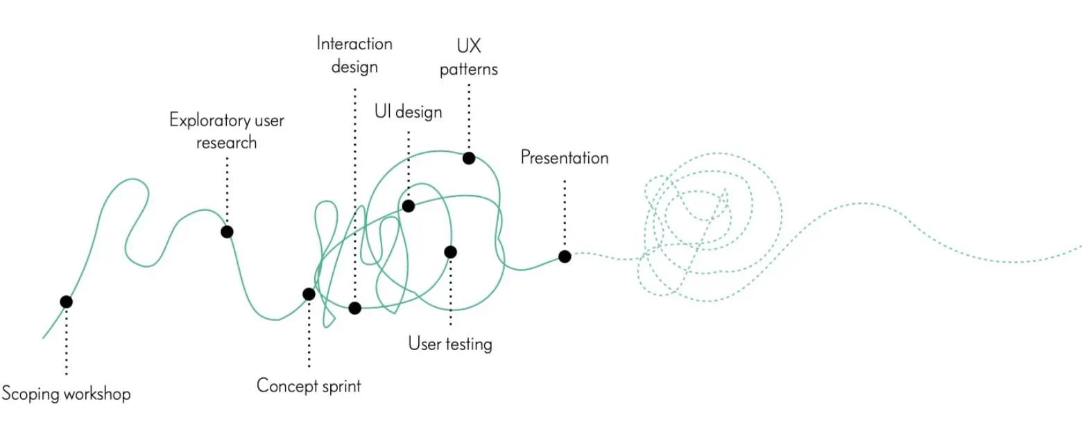
A three-day workshop with the client to agree the scope, success criteria and guiding principles.
A user journey for each kind of investor, marking the moments that needed the most care.
A simple sprint board so the bare minimum got built first.
Semi-low-fidelity wireframes, iterated through the year as features and feedback came in.
Visual design, starting with onboarding, reviewed with the back-end developers at each step.
Internal critiques, user testing and technical checks, so each concept fit the existing platform.
I set up a deliberately simple board in Asana. Four columns were enough to keep a client team, developers and designers looking at the same week:
Everything planned for the week.
What was being worked on that day.
Anything carried over from the previous sprint.
Finished and reviewed.
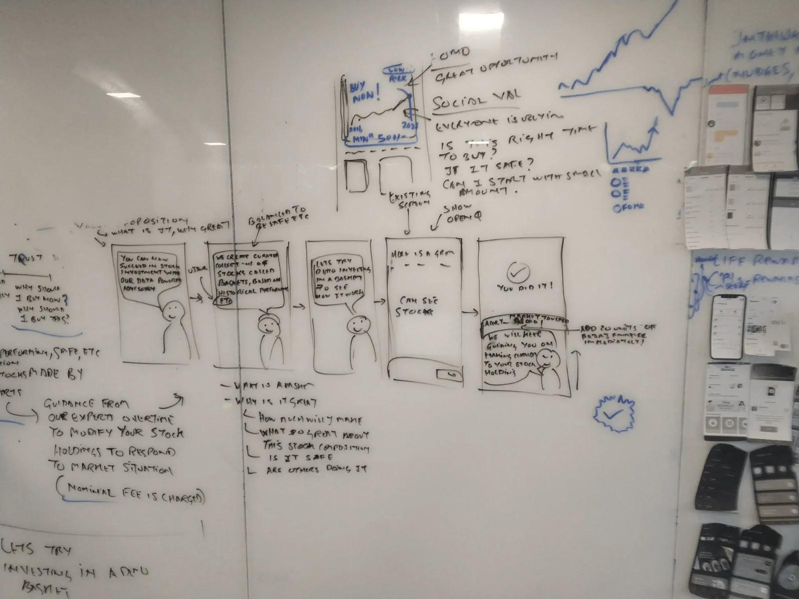
I sketched and prototyped several ideas for each flow, then refined them through internal critiques, user testing and technical checks. Three decisions shaped the product most.
If it needs a tooltip, it needs another look.
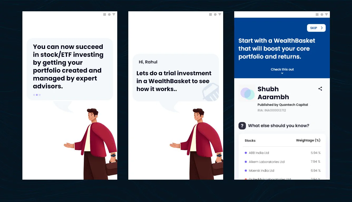
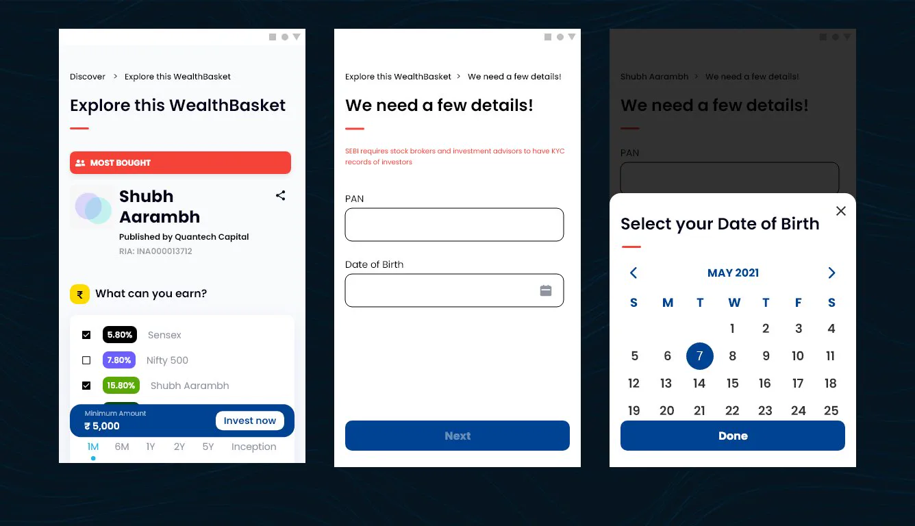
Onboarding introduces baskets through a friendly guide and a trial investment, game-like and step by step, so a first-timer understands what they're buying before being asked for anything.
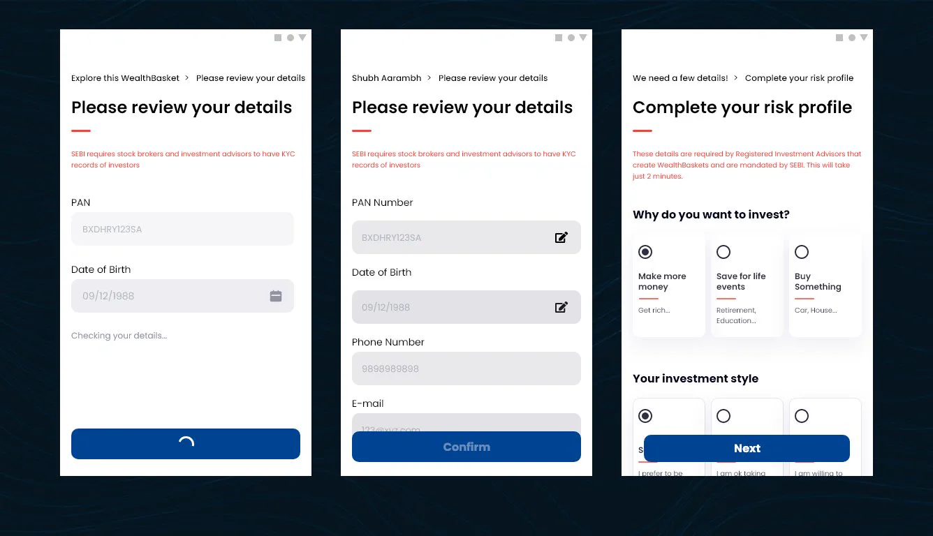
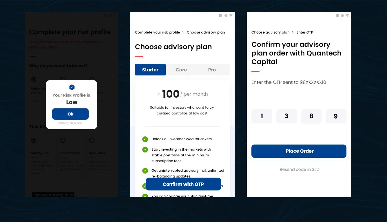
A short risk profile and a clear choice of advisory plan come before the first purchase, so the baskets people see match how much risk they're comfortable with.
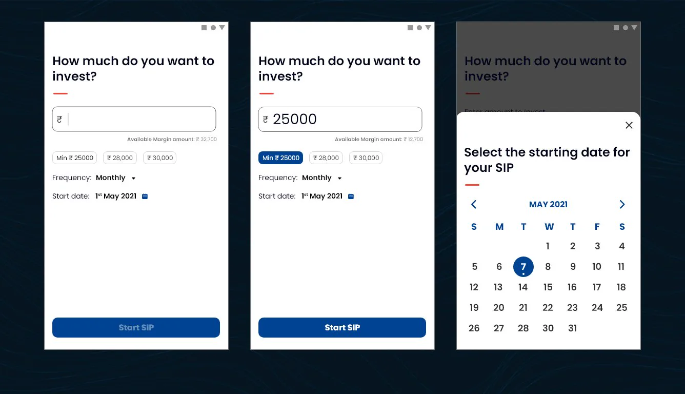
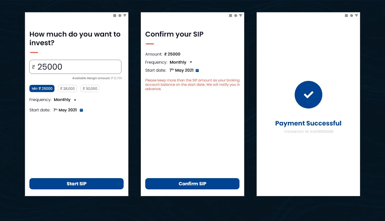
For everyday investors, a systematic investment plan takes an amount, a frequency and a start date on one screen, then a confirmation. Regular investing becomes a habit, not a chore.
Onboarding came first. Once it worked, I walked the back-end developers through it to check it against the platform, then moved on to purchasing and SIPs.
A guided, game-like first run
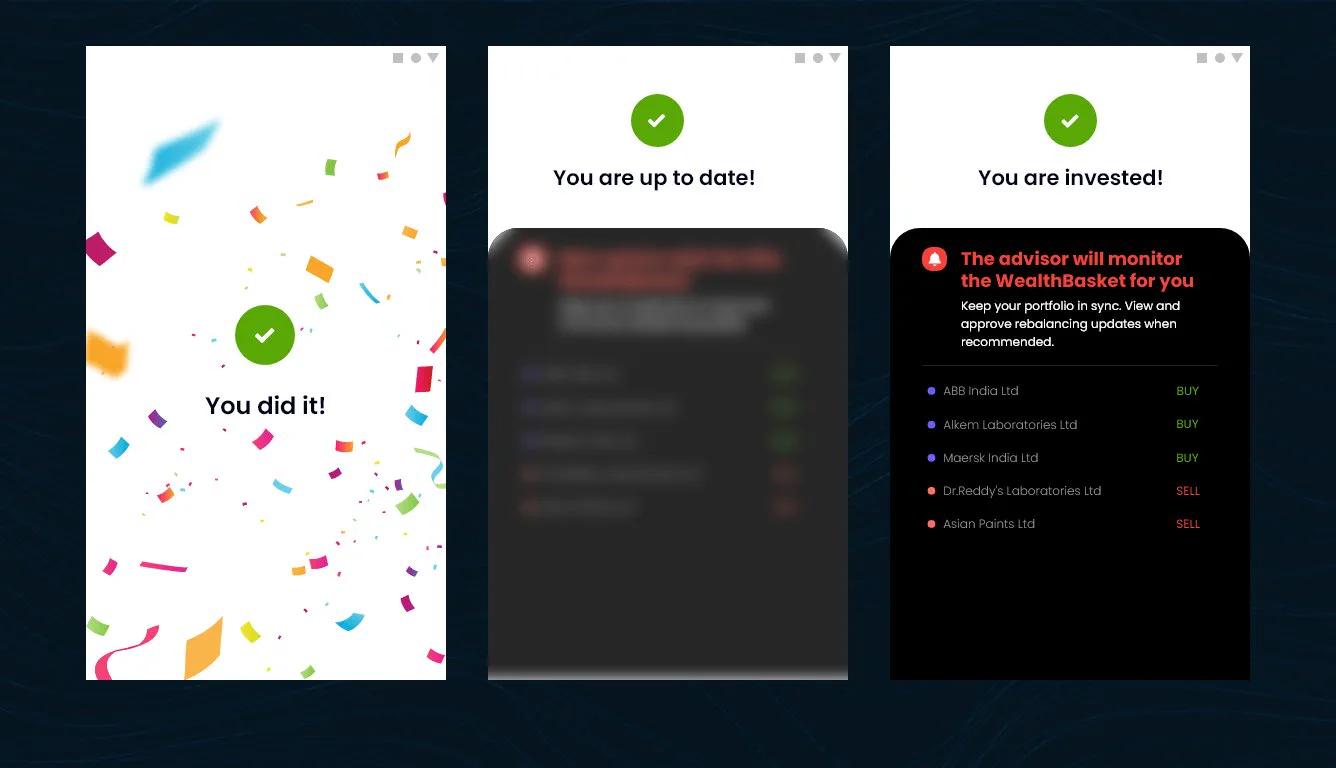
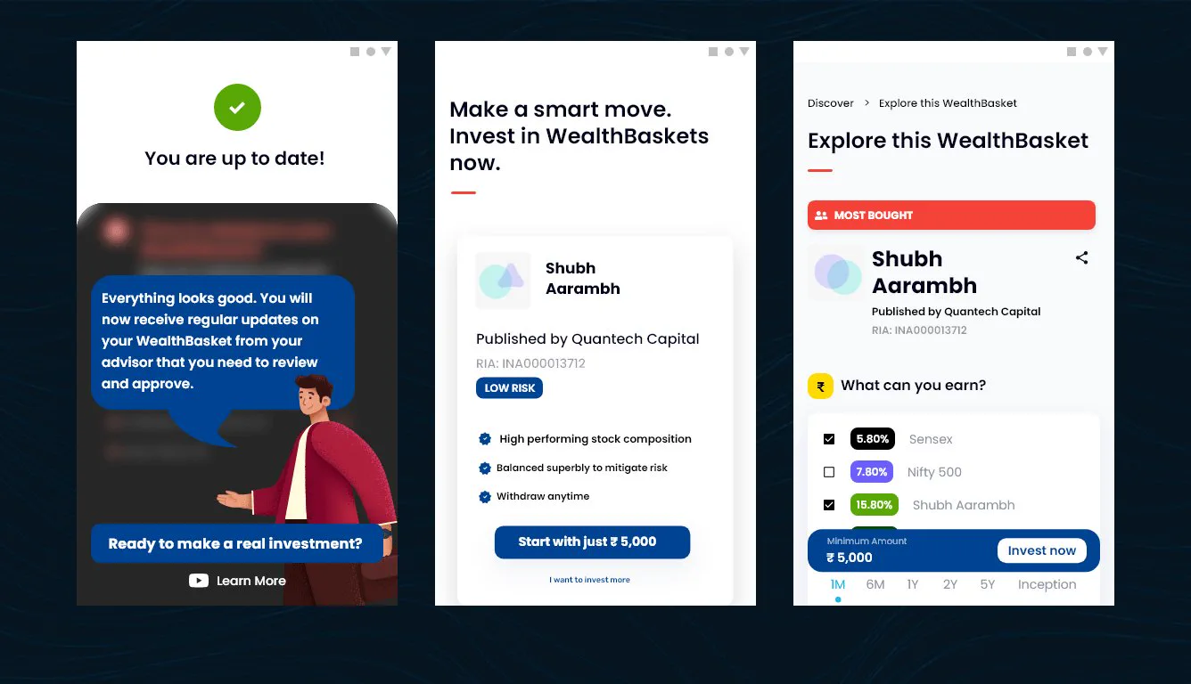
The first purchase
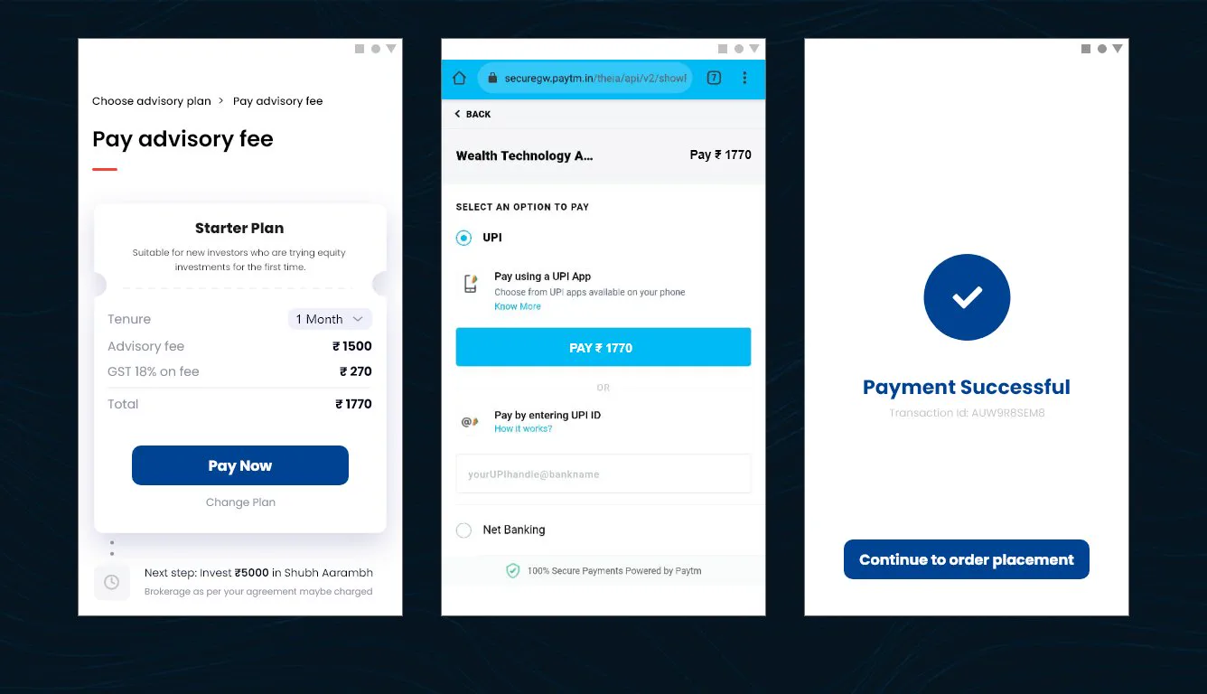
After the first purchase
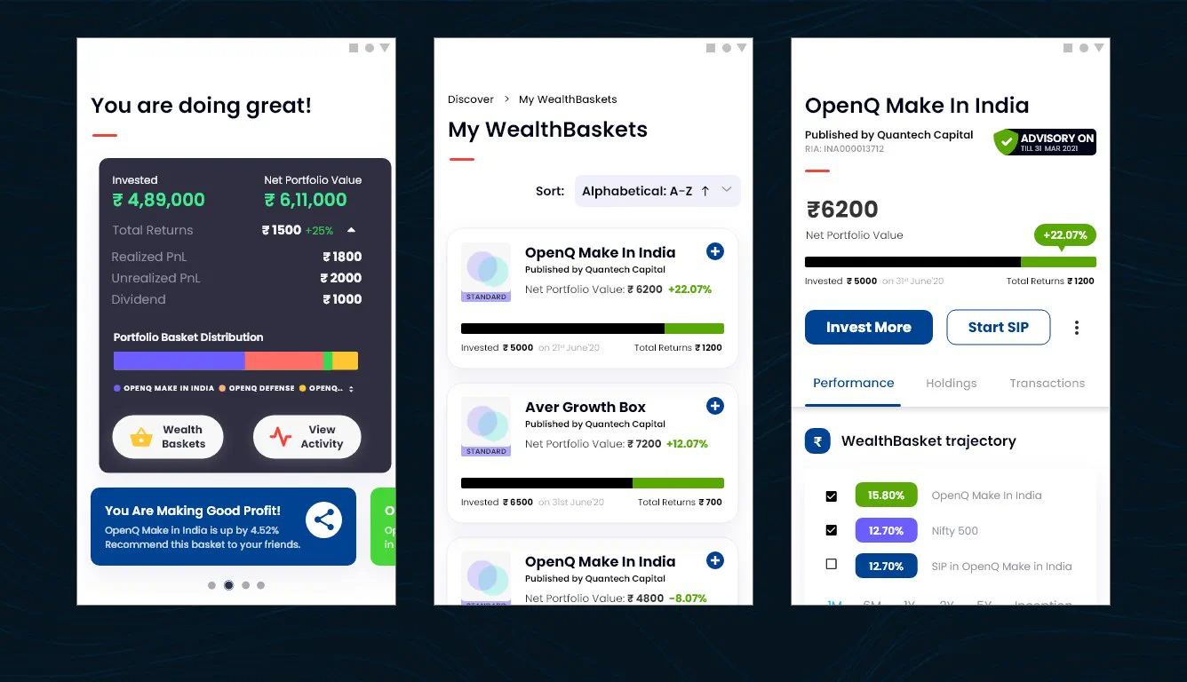
The same flows carried over to Paytm Money on the web, so investors could check and manage their baskets from a browser after buying on their phone.
After purchase, in the browser
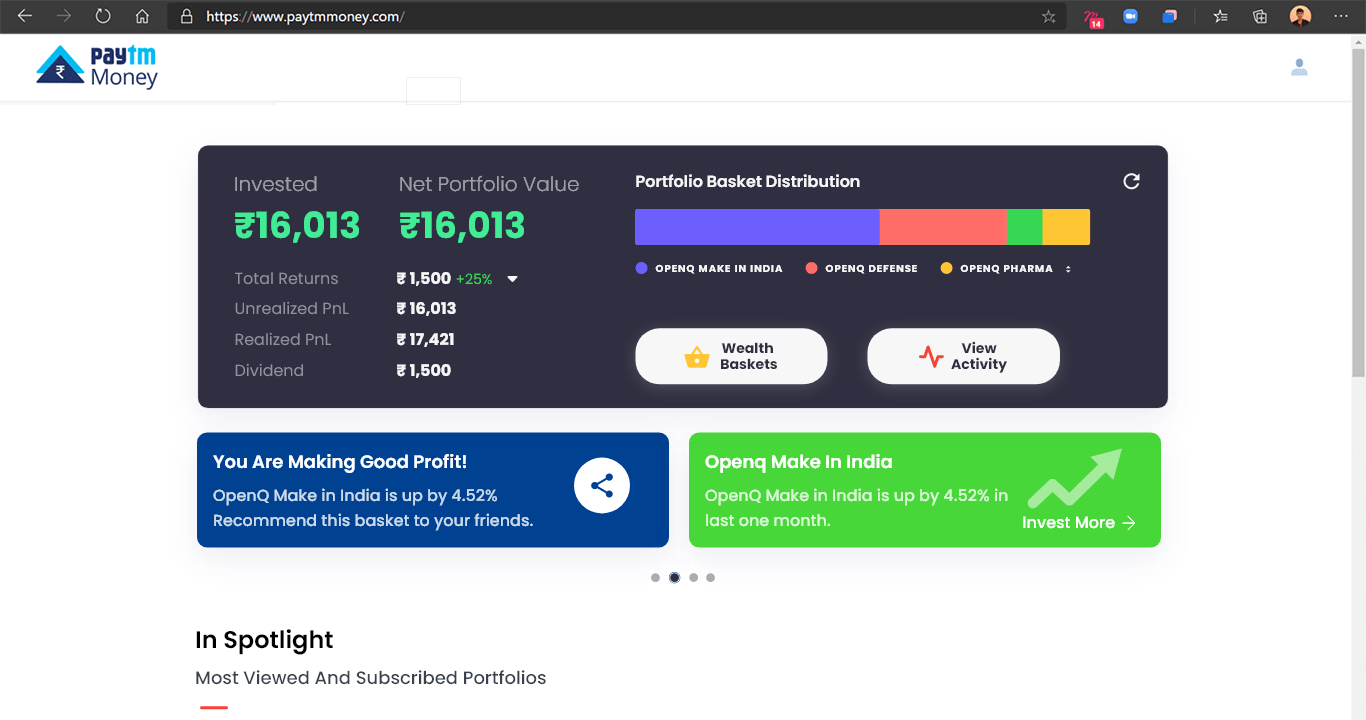
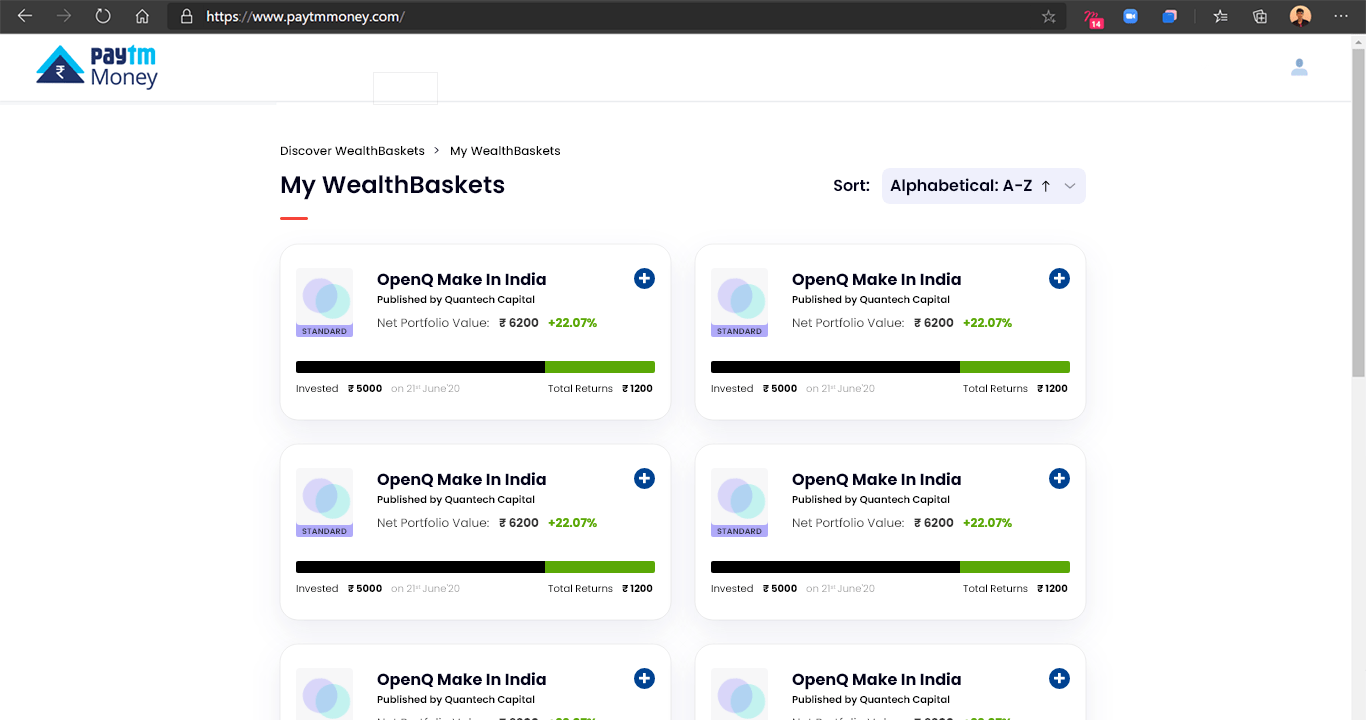
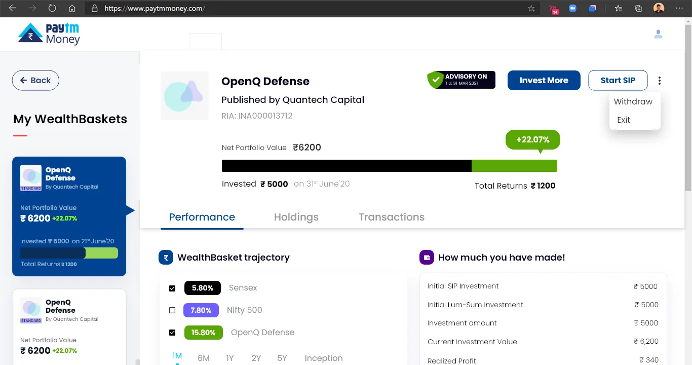
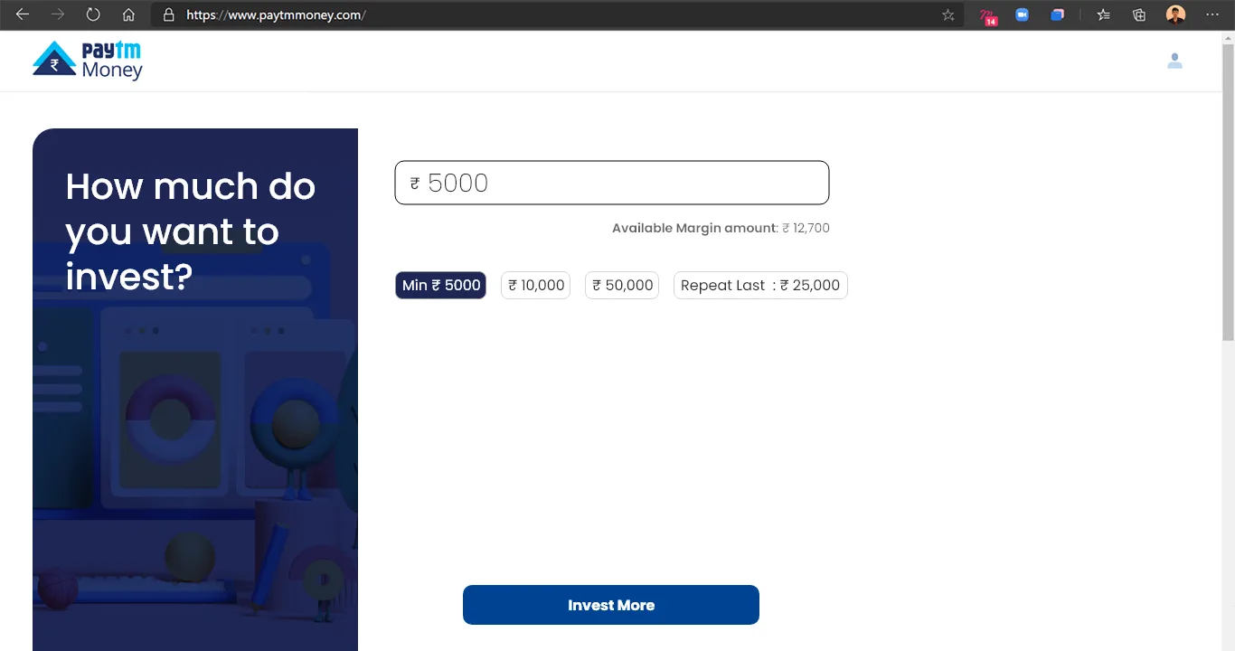
The flows went into the build with the client's team, and Paytm Money took WealthBasket to market. I wasn't able to test or measure the designs after handoff, so I can't share usage numbers; the screens above are the work as delivered.
As an early fintech enthusiast, this was a chance to learn investing products first-hand. I'm grateful for it, and there are things I'd do differently now.
The client taught me how differently people approach high and low investment, and it still shapes how I design fintech products.
The project's scale and the stakeholders' priorities didn't line up for post-launch testing. Next time I'd agree success measures before the build starts.
With what I know now, I'd bring testing earlier and keep the scope tighter. That's what the project was for: learning.
Some details are left out because the work is confidential. My role was to help frame the product's long-term direction, run the research and make sure the design held up. If you'd like to know more, email me and we can talk it through on a call.